(P1,M1)Proposal


Type of Proposal
My proposal is for a print campaign centred around promoting Liverpool as a destination and bringing people to it.
Form and Genre
Print products are physical advertisements, and I'm mainly focusing on posters, ads in magazines/newspapers, leaflets, as well as some online advertising as the files to create them can be reused to reach a wider audience. I must make these ads as interesting as possible to gather attention.
Content
The ads will include landmarks and icons of Liverpool in order to show off the city. I also need to have a style that will interest people so that they will actually take a look at what's being shown, and there needs to be at least a little bit of text to make the location clear and intriguing.
Target Audience
The audience for the campaign is families. While that's extremely broad, its necessary as the goal of the campaign is to bring as many people as possible to the city. However this means that I need to create something that has visual appeal to both adults and children as it needs to look exciting and interesting.
Resources and Personnel
I will need various photos of places and icons in Liverpool. While its possible to get some of this online it may also be necessary to go out and get photos myself if possible. As well as this I'll need to use multiple software to create the product: Illustrator for drawing images to use, Photoshop for editing images, and InDesign for putting it all together.
Distribution
The ads will be distributed in travel magazines and newspapers as the idea is to bring people on holidays. If somebody is looking for a holiday they will be more likely to see the ads and engage with them during their search. By distributing them digitally it also allows for targeted advertising through Google or other websites like Instagram and Facebook. I also plan to include them on travel websites like Tripadvisor, and a social media account may also be a good way of distributing online. Online distribution is very helpful as it can also help to reach out to a more worldwide audience.
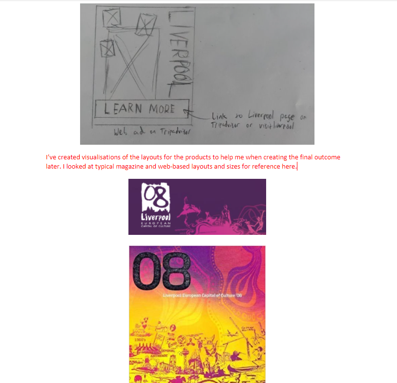
I made different plans for the various print products to help for scheduling and creating the products I'm looking to create. This includes visualisations for print ads, pamphlets and web ads, and a wireframe for the campaign's website.


(P4,M3)Elements of Production
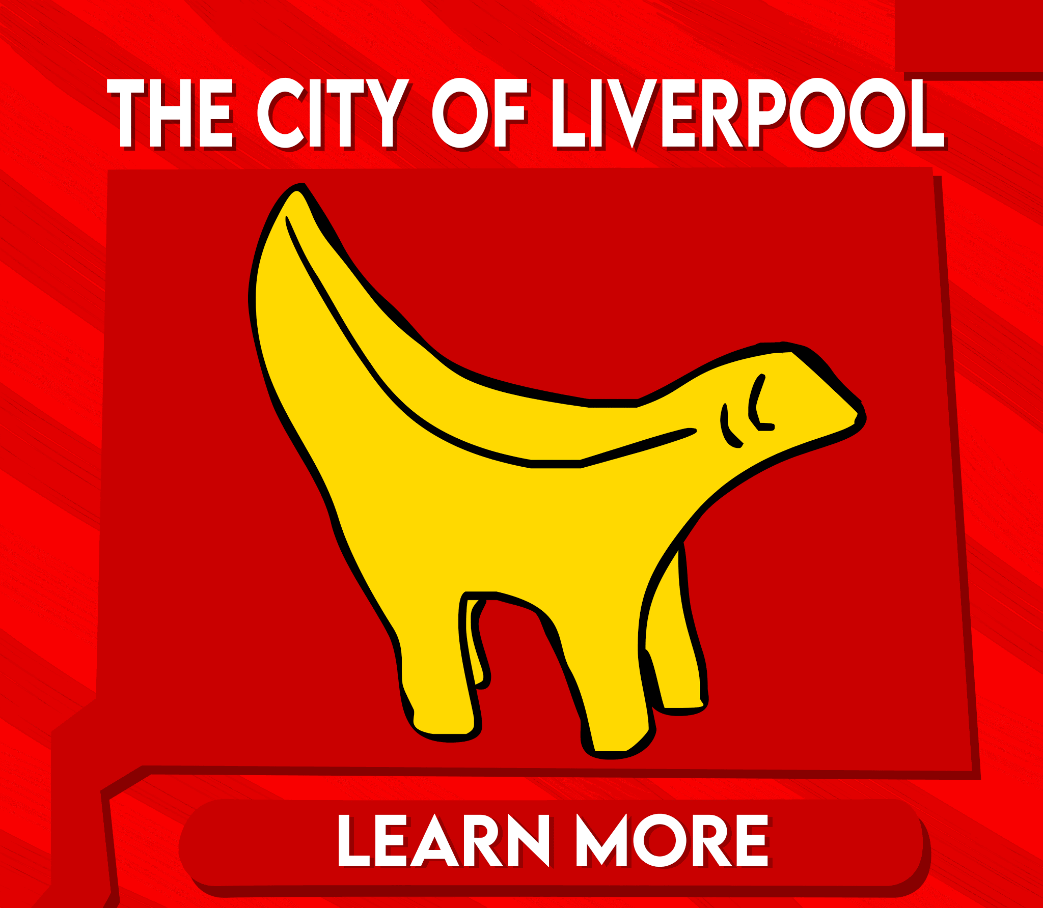
When creating the final products there were some assets I wanted to make beforehand. For web ads I wanted something that was animated, so I drew in Flash and created a GIF. I also used Illustrator for some drawings in my print products. The lambanana illustration was made with the pen tool, tracing the shape, and observing the shading. Along with this I wanted to create a Twitter account for the campaign to have more of an online presence, so I used one of these when making a profile picture.


 |
| (process of the order I made the layers in) |

(M2)Legal and Ethical Issues
There are potential issues that come with the production of the campaign. One issue that can come up is the use of images from a second hand source. If they aren't taken off a free source or I'm not licensed to use then I'd face legal repercussions. When getting images I found free sources without watermarks so I could avoid this problem.
For anything that includes written information, it must be accurate and honest because if not it would be false advertising that could mislead consumers. There is the possibility of legal action but it would also lower the reputation of the ad campaign.
A potential ethical issue could be the suitability of the ads. The content must be suitable for all of the distributors and regulatory bodies or else they won't be shown. This isn't an issue however, as there is nothing I've put into my ads that would be considered unsuitable. Any representation of people must not be harmful to them, as it may be upsetting. My ads don't include people in them, aside from The Beatles as figures of Liverpool, so this isn't something I need to worry about. All of this falls under regulation theories by theorists like Livingstone and Lunt which cover protecting citizens from harmful content.
(P5)Products

(Magazine/Poster ad)

(Magazine/Poster ad)
(Online ad)


(Billboard ad)

(D1,M4)Analysis of Techniques and Design
When making these ads I used the pen tool to draw the shapes that most of the text and images are against. I made these to have some distinct identity for them. I used filters like cutout in Photoshop, and used live trace in Illustrator. Then colour replacement tool was used a lot across the ads for the vibrant colours I have on the buildings and such. For the billboard's background, I used a splatter brush with a solid green colour on a new layer once everything was in place. Then I colour selected all the greens and applied a gradient to have the effect here. For the backgrounds in the others, I used different brush types in Photoshop and darker shades of red to make it less plain without distracting from the rest. I heavily used red as its associated with Liverpool, and I thought the bright colours would help gather attention. It helps the landmarks and icons to pop out which is good because its what I'm trying to highlight about the city. I used a sans serif font because the more sophisticated serif fonts wouldn't fit with the more simplistic and minimal style of everything else. It gives a very clean look to them and helps to make it accessible for the wide audience that I'm targeting. The colour was white simply to make it readable, but it also works in a minimalistic way. Steve Neale's genre theory means that I've used typical conventions to create my ads. For example, for the web ads I created parts that say "learn more" as this is usually seen in web ads. I also followed typical layouts and templates for the design of the website.
I think a strength of the ads is that they can catch attention due to the colours and style, however they fall short of information. Most of the ads here can't take you to a website so not having the website name written or something similar can be a detriment. I have met the brief that I originally set out to do as I have used a unique style featuring various icons of the city and have created a variety of adverts that can be displayed in different places. Along with this I think I successfully made the ads able to target my audience, as they have a distinct style to look interesting but are also simple so that they can be understood by anybody. Some things didn't go as planned however, as the Twitter page I intended to make wasn't able to be made due to issues I had in creating the account. At first I didn't intend to make a website, however I ended up doing this as another way to ad to my online presence. This worked out well because of the issues with creating a Twitter page.

 |
| Demo of website (WIP) |
My website's link is here. While its not finished entirely it should give a good idea of its purpose.
Excellent Alex, great overview of your proposal and content for your promotional products.
ReplyDeleteExcellent Alex, great overview of your proposal and content for your promotional products.
ReplyDelete