Research

Advertising History/Recent Campaigns
Diet Coke has a history of TV/audio visual and print advertising and they are the mediums I chose to research and use to create my own advertising for the product. I have experience with these lines of work and they can reach a wide audience. Many times a print advert can be repurposed to be used online as well so it might be a good idea to keep that in mind when designing. TV adverts can also be used on websites like YouTube which helps to reach a wider audience.
The Diet Coke brand hasn't been around any near as long as the main Coca Cola product. It was created in 1982 and used the slogan "Just for the taste of it". This was used more in print ads from what I can tell.
This TV ad was aired in the UK in 1984. Its really different from their adverts nowadays, it has a narrator and has a song made for the ad. Its also kind of sexual as almost everyone in the advert is wearing a revealing swimsuit. This would've been done to make the product look better to people, or to say as if you'll look like that by drinking diet coke. Its aspirational in another way, which is wealth. The advert heavily features people on holidays, which were less common in the 80's. This could also be seen as appealing more to upper class/wealthier people. I don't think this would pass today, people might object to the more sexual nature and I also don't think it does a good job of creating an identity for the brand as there's nothing unique I could get from it.

This print ad is quite simple. It has a shot of a can and glass of the drink, with a striped backing and the slogan. After looking at newer ads,they don't seem too different nowadays. 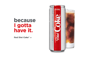

This ad also uses an image of a can and glass along with a slogan. I think because there is much less you can do with a print ad there wasn't much room to change.
 |
| TV advert from 1984 (link here) |
This TV ad was aired in the UK in 1984. Its really different from their adverts nowadays, it has a narrator and has a song made for the ad. Its also kind of sexual as almost everyone in the advert is wearing a revealing swimsuit. This would've been done to make the product look better to people, or to say as if you'll look like that by drinking diet coke. Its aspirational in another way, which is wealth. The advert heavily features people on holidays, which were less common in the 80's. This could also be seen as appealing more to upper class/wealthier people. I don't think this would pass today, people might object to the more sexual nature and I also don't think it does a good job of creating an identity for the brand as there's nothing unique I could get from it.

 |
| Link to video |
These adverts are a part of the "because I can" campaign that they ran in 2018 and 2019. They aimed to get across that life is about doing what makes you happy. The campaign was poorly received by a lot of people because it felt boring and patronising to them. In my opinion it doesn't do anything to stand out and I don't really understand why its trying to get that point across for Diet Coke specifically. It may be because of the reception that later in 2019 there was a new advertising effort.
I also feel like the presentation doesn't work with the message of the adverts. It conforms so much to regular advertising which defeats the idea of doing whatever you want. By this I mean that the font is very generic and that the lighting and movement of the camera isn't interesting. These aspects are fine on their own,but I just feel they go against the message and all add up with that idea in mind.
 |
| Link to video |
 |
| Link to video |
These two adverts are a part of the newer "you do you" campaign, which has a similar message which I still don't exactly understand. Its about embracing who you are instead of just following suit, which I'd guess ties in with the differences between diet and regular Coke but I'm still not entirely sure. However I do think these adverts are much more effective than the last campaign because they have more flair and humour, it makes them more memorable and feel more unique.
The advertising fits more to its message than the last campaign because of this sense of humour and how it uses trending phrases. The lighting and camerawork aren't a big step up from the last campaign,
but thanks to it's other aspects it doesn't matter.
Both adverts have an older person saying some kind of trending phrase which I think works to show how they're different than you'd expect, fitting "you do you". This also makes the adverts quite funny and memorable because it subverts your expectations.
Planning


I made mind maps to generate and get down ideas for my adverts. If I lose track I can look back at this to get back or to use other ideas.

 |
| (I later made this for a narrated part of the advert) I want to style this narrated part like my print adverts so there is a sense of consistency which would help it feel like a proper campaign. |

I made a script as an alternate way of getting the plan down. Since there's no drawing its much more descriptive. I tried to format it like a proper script would so I looked at what typical scripts would look like.

I made these sketches to work off of for my print ads in Photoshop, just getting down the basic layout of the ads and the colours of the backgrounds.

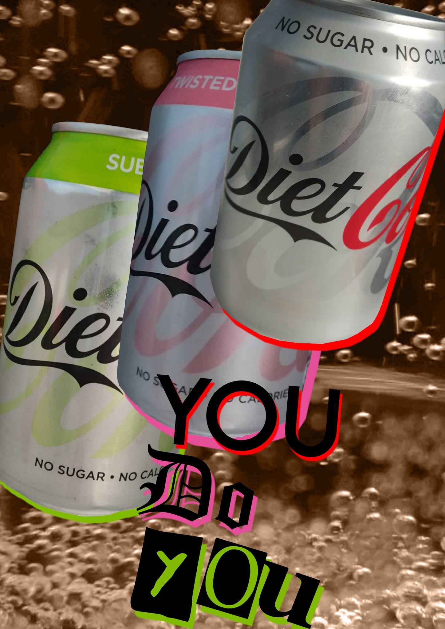
I've also made a general plan of a print advert on Photoshop. I used images I found online when making this, so the final one would be using first hand images. I think I'd also use different fonts but the general idea for that is that the fonts are unique and different than each other to fit the message of "you do you".
I've made variations so I can try more ideas or to see if different layouts work better.

I moved things around from the first draft to create this one. I moved the text so it was in line with each flavour that the text represented, and I changed the background colour to brown to look like the drink does. I think the first looks better because the colour matches more, and the text isn't blocking anything.

I made this to fit an A4 page, like a magazine advert might. I wanted to use different fonts just to see if they would look any better and I think I like this more as they're more distinct. The idea of this was to translate the first design's idea into the different layout and I feel it gives the same feeling. I also changed the background to see what drink bubbles would be like and I think it works just as well.

Again I just moved around everything in the design above. I changed the background to brown once more and I still don't think it works as well as the grey background. I also lined up the text's shadows with the can's shadows so they're connected which I think looks nice.


I got first hand photos to use in my ads so I wasn't using images found online. I'll have to crop and remove the backgrounds of these when using them. The bottom images will replace the bubble backgrounds I found online.


These are updated adverts using the first hand images I have at this point, I still need to get more but I think it already looks much better.


I got more first hand photos to use for my ads. These images may be more useful than the ones I originally took thanks to the better lighting/less reflections and other conditions like the bubbles. I retook a photo of the lime flavour,this time it was after I'd put it in a fridge. Because it had condensed a bit it reflected less off the can, meaning the can wouldn't reflect my arm when taking the photo. This makes the can so much easier to work with, as when I updated the adverts I had to cover my arm up in Photoshop.


When I made this version, I used one of the images above. However it wasn't big enough to fit a background, and stretching it out would make it look pretty bad. So what I did was duplicate the image, flip it, and put the images on either half of the file. There was a noticeable line where the images overlapped so to avoid this, I merged the images together and used the mixer brush tool to blend the line into the image.


For a few of these images I had trouble getting a good colour with the colour replacement tool. The greys and browns could be too dark or light for what I wanted. To avoid this I made a new layer above the background image, picked a colour I thought fit, and lowered the opacity. This let me control the background's colour more freely.


(update from feedback)


One of the first things I did when putting this together was create a background for the end card. I got the dimensions of the images and videos I was using and applied that to Photoshop. Above shows how I ended up making it. I used one of my own images and cropped it, and as shown duplicated it so it wasn't stretched out to fit.


To create the animated part it was as simple as taking some pictures and then drawing over them. After I had these outlines I simply filled the inside white to match the drawing in the video. Then all I had to do was sequence them with the rest of the video,keeping their length really short so they seem to move.

An important aspect was the audio mixing. Since I had both music and narration at the end I needed a way for the voice to be heard. I had to lower the volume of the music at a specific point and I did this by using the pen tool on points of the audio, then dragging down the middle of those points.

When creating the end card I had to resize and rotate my images to make sure they fit the stage.

To then make them slide in I used the push transition and had to use the effect control panel on the upper left to make sure they slid in from right to left, and how quickly this happened. I positioned the images slightly after each other in the timeline to make sure they didn't all come in at once, which would've looked worse I think.

This is just how my final timeline came to look. I had to redo it a few times, for example at one point I forgot to cut when I turned off the camera in the fridge so I had to go back and cut that out.
The song I used for my video was Life Goes On from the Persona 5 soundtrack. I chose it because I felt the tone of the song fit the setting and tone of the advert, and stock music just didn't do the same thing.
Absolutley fabulous work here Alex - keep up this level of analysis and progress with your designs. Develop thumbnail ideas and sketches of ideas please with further insightful analysis.
ReplyDeleteMrs McD-H